
Responsive Website Design: 10 Mistakes That Hurt Conversions And How to Fix Them
A website can look attractive on a desktop and still lose potential customers on phones and tablets. Visitors may struggle to read text, find buttons, complete forms, or understand what to do next. These problems can quickly turn interested visitors into people who leave without taking action.
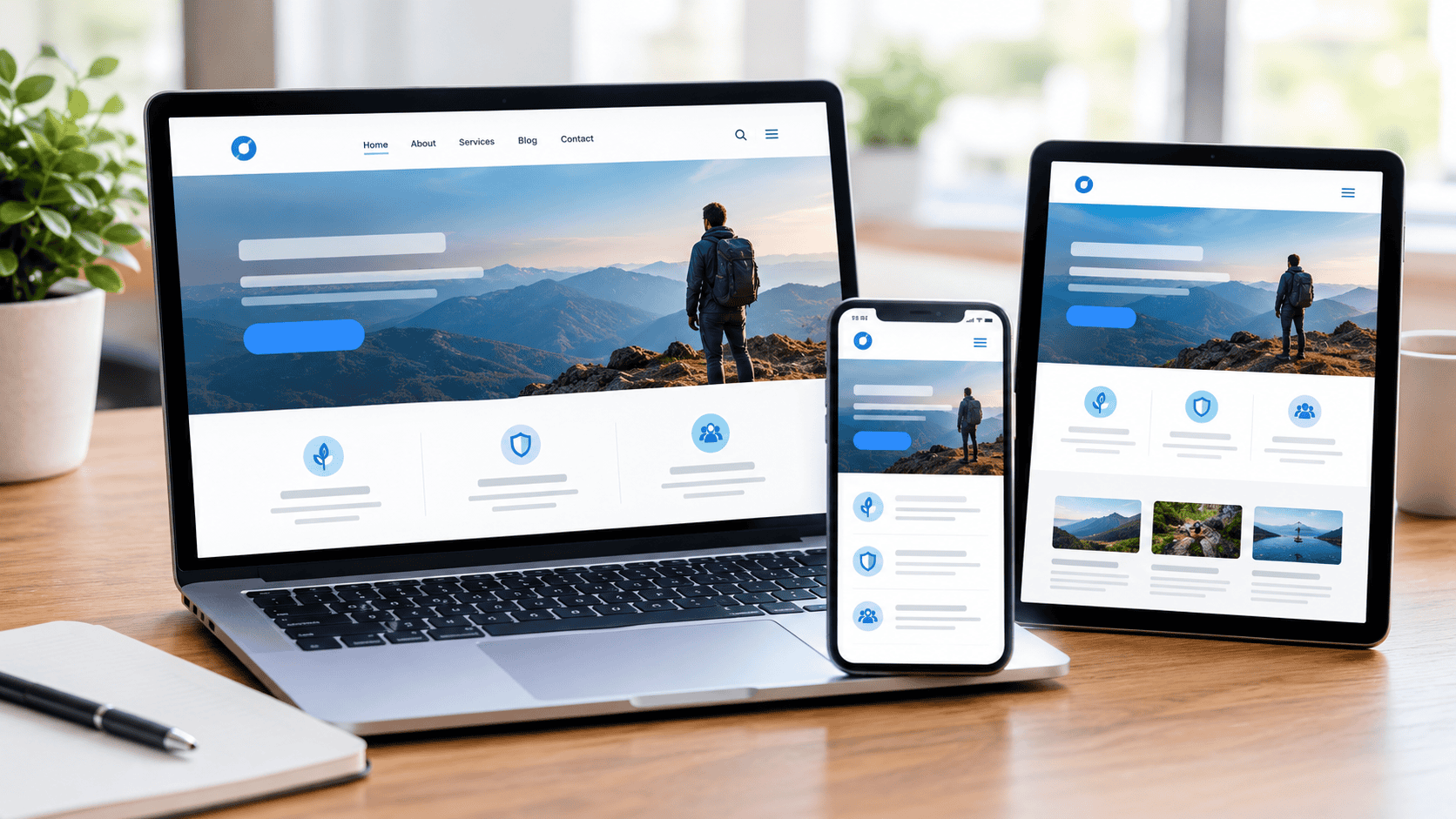
Responsive design helps a website adjust to different screen sizes and devices. But simply making a website mobile-friendly does not guarantee better conversions. Poor layouts, slow pages, difficult navigation, weak calls to action, and other design problems can still affect results.
For businesses that want to improve the experience across different devices, Maxify Marketing can help identify common design issues and create a clearer path from website visit to conversion. The goal is not simply to make every page fit a smaller screen. It is to make the entire experience easy to understand and use.
Why Responsive Design Matters For Conversions
People visit websites from many different devices, and their expectations are shaped by how quickly and easily they can interact with a page. A website that works well on one screen but feels difficult on another can create unnecessary friction.
Responsive design should make content, navigation, images, forms, and interactive elements work together across different screen sizes. When visitors can find information without struggling, they are more likely to stay engaged and take the next step.
A strong mobile experience should provide:
- Readable content: Text should remain easy to read without excessive zooming or scrolling.
- Simple navigation: Visitors should quickly understand where to go next.
- Accessible buttons: Calls to action should be easy to tap on smaller screens.
- Balanced layouts: Content should fit naturally without awkward spacing or overlap.
- Consistent branding: The website should feel like the same business across devices.
The following mistakes can prevent a responsive website from delivering that experience.
Mistake 1: Designing For Desktop First And Ignoring Mobile
Desktop screens provide more space, but that does not mean the mobile experience should be treated as an afterthought. A layout that works beautifully on a large monitor can become crowded and difficult to use on a phone.
Mobile visitors often interact with a website differently. They may be looking for a phone number, service information, directions, a product, or a simple form while they are away from their computer.
To avoid this mistake:
- Review mobile layouts early: Test important pages before the design is finalized.
- Prioritize key content: Put the most useful information where visitors can find it quickly.
- Simplify complex sections: Remove unnecessary elements that create clutter on smaller screens.
- Test real interactions: Check menus, buttons, forms, and links instead of only viewing screenshots.
A mobile-first mindset can help prevent major usability problems before they affect visitors.
Mistake 2: Using Buttons That Are Hard To Tap
A button can look perfectly fine on a desktop while becoming frustratingly small on a phone. If visitors have to tap repeatedly or accidentally select another link, the conversion experience suffers.
Calls to action should be obvious and easy to interact with. Their size, spacing, wording, and placement all affect how easily people can use them.
Keep these points in mind:
- Use comfortable button sizes: Give visitors enough space to tap accurately.
- Separate nearby links: Avoid placing several interactive elements too close together.
- Make actions obvious: Use clear wording that tells users what happens next.
- Keep important buttons visible: Place primary actions where users can find them naturally.
- Test with different devices: A button should work well across various screen sizes.
Small improvements to interactive elements can remove unnecessary friction from the conversion path.
Mistake 3: Making Navigation Too Complicated
Visitors should not have to figure out how your website works before they can find useful information. Complicated menus can become even more difficult on smaller screens.
A clean navigation system helps users understand the structure of a website. It should guide people toward important pages without overwhelming them with too many choices.
A simpler navigation approach can include:
- Clear menu labels: Use familiar words that explain what each page contains.
- Logical categories: Group related pages together so users can find them naturally.
- Visible contact options: Make it easy for visitors to reach the business.
- Short mobile menus: Avoid filling mobile navigation with unnecessary links.
- Consistent placement: Keep navigation behavior predictable throughout the website.
Website design experts often focus on navigation because it affects both usability and the visitor’s ability to reach conversion-focused pages.
Mistake 4: Allowing Pages To Become Too Long
Long pages are not automatically bad. The problem occurs when visitors must scroll through large amounts of unnecessary content before reaching something useful.
A responsive layout should make long-form content easy to scan. Clear headings, short paragraphs, useful visuals, and well-placed calls to action can make a long page much easier to use.
Consider these improvements:
- Break up large sections: Use headings and short paragraphs to improve readability.
- Highlight important information: Make key benefits and actions easy to spot.
- Remove repetition: Keep each section focused on a clear purpose.
- Use visual breaks: Images and spacing can make long pages feel easier to navigate.
- Place relevant calls to action: Give visitors a clear next step when they are ready.
The goal is not simply to make a page shorter. It is to make every section useful.
Mistake 5: Using Images That Do Not Adapt Properly
Images can improve a website’s visual appeal, but poorly handled images can create major problems on smaller screens. Oversized images may push important content down the page or make pages load slowly.
Images should be optimized for both appearance and performance. They should fit naturally within the layout without creating horizontal scrolling or distorted visuals.
A better image strategy includes:
- Responsive image sizing: Images should adjust to available screen space.
- Useful file formats: Choose formats that balance quality and file size.
- Descriptive alternative text: Provide useful descriptions where appropriate for accessibility.
- Consistent proportions: Avoid stretched or distorted visuals.
- Relevant imagery: Use images that support the content rather than simply filling space.
A visually attractive website still needs to perform well across different devices.
Mistake 6: Making Forms Difficult To Complete
Forms are often one of the most important conversion points on a website. If completing one feels difficult on a phone, visitors may abandon it before submitting their information.
Forms should ask only for information that is genuinely needed at that stage of the customer journey. Long forms can create unnecessary hesitation.
Improve form usability by:
- Reducing unnecessary fields: Ask only for essential information.
- Using clear labels: Visitors should immediately understand what each field requires.
- Making fields easy to select: Inputs should work comfortably on touchscreens.
- Providing clear error messages: Tell users how to correct a problem.
- Using strong submit buttons: Make the final action easy to identify.
Web design services should consider forms as part of the overall conversion experience rather than treating them as separate website elements.
Mistake 7: Ignoring Page Speed
Visitors generally do not want to wait for a page to load before they can see what a business offers. Large images, unnecessary scripts, excessive animations, and poorly optimized resources can slow down a website.
Performance matters because a slow experience can make visitors leave before they engage with the page.
Look for opportunities to:
- Compress large images: Reduce unnecessary file weight without sacrificing useful quality.
- Remove unused elements: Eliminate scripts and features that do not serve a purpose.
- Optimize page resources: Make sure important content loads efficiently.
- Limit unnecessary animations: Use movement only when it improves the experience.
- Test important pages: Check performance on both desktop and mobile connections.
A faster website gives visitors fewer reasons to leave before completing an action.
Mistake 8: Hiding Important Information On Mobile
Some websites remove or hide useful information from mobile layouts to make pages look cleaner. This can become a problem when visitors need that information to make a decision.
Mobile users should still have access to essential details such as services, contact information, benefits, location details, and important next steps.
Make sure mobile visitors can easily find:
- Contact details: Give visitors a clear way to reach the business.
- Service information: Explain what the business offers without unnecessary searching.
- Trust signals: Display useful reviews, credentials, or relevant proof where appropriate.
- Key benefits: Show why the visitor should consider the business.
- Conversion options: Make the next step easy to identify.
A clean mobile layout should simplify information, not remove information that customers need.
Mistake 9: Forgetting Local And User Intent
A website should reflect what visitors are actually trying to accomplish. Someone searching for a service in a specific location may want quick answers about availability, expertise, service areas, and how to get started.
A web design agency in Arizona, for example, may need to think carefully about how local businesses present their services to people searching from nearby areas. The same principle applies to businesses serving different cities or regions.
A conversion-focused website should:
- Address visitor needs: Build pages around real questions and problems.
- Explain services clearly: Avoid vague descriptions that leave visitors guessing.
- Show relevant locations: Make service areas easy to understand.
- Use useful calls to action: Connect visitor intent with an appropriate next step.
- Keep information current: Remove outdated details that could create confusion.
Understanding user intent helps turn a website from a simple online brochure into a more useful business tool.
Mistake 10: Failing To Test The Complete User Journey
A website can appear responsive while still having problems that only become obvious when someone actually uses it. A menu may fail, a form may not submit, or an important button may be difficult to find.
Testing should cover the full journey from the first page visit to the final conversion action. This provides a better picture of how the website performs in real use.
Test important areas such as:
- Navigation: Make sure users can move between key pages without confusion.
- Forms: Submit forms from different devices and check that they work correctly.
- Buttons: Test every major call to action for visibility and function.
- Content: Check that headings, images, and text display correctly.
- Checkout or booking: Test important transaction steps from start to finish.
- Contact options: Confirm phone numbers, email links, and other contact methods work properly.
Testing should be repeated after major design or content changes because new updates can introduce unexpected problems.
How To Improve A Responsive Website Step By Step
Fixing every design issue at once can feel overwhelming. A better approach is to prioritize problems based on how strongly they affect usability and conversions.
Start with the pages that receive the most traffic or generate the most important customer actions. Then work through the experience from the visitor’s perspective.
For additional guidance on making a website easier to use across different devices, explore Simplifying Website With Responsive Design Services. This can provide useful context when reviewing responsive design improvements.
A practical improvement process can include:
- Review mobile performance: Identify the biggest problems on smaller screens.
- Check navigation: Make sure visitors can reach important pages easily.
- Test conversion points: Review forms, buttons, calls, and other actions.
- Improve readability: Break up dense content and improve spacing.
- Optimize media: Reduce unnecessary image and video weight.
- Track results: Compare performance before and after important changes.
Small improvements can add up when they remove repeated points of friction from the visitor journey.
Turn Better Design Into More Conversions
Responsive design is about more than making a website shrink to fit a phone screen. The strongest websites consider how visitors read content, navigate pages, interact with buttons, complete forms, and make decisions across different devices.
Fixing common problems such as complicated navigation, slow pages, poor forms, oversized images, hidden information, and weak calls to action can create a smoother path toward conversion. Testing the complete user journey then helps uncover problems that may not be visible during a simple visual review.
Contact us today to discuss how your website can be improved for a clearer, easier, and more conversion-focused experience. With the right approach, Maxify Marketing can help businesses turn responsive design improvements into a website experience that is easier for visitors to use and more effective at encouraging meaningful action.